
SEATTLE THUNDERBIRDS
2022 - 2023 Season Branding
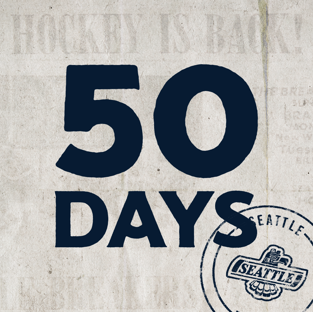
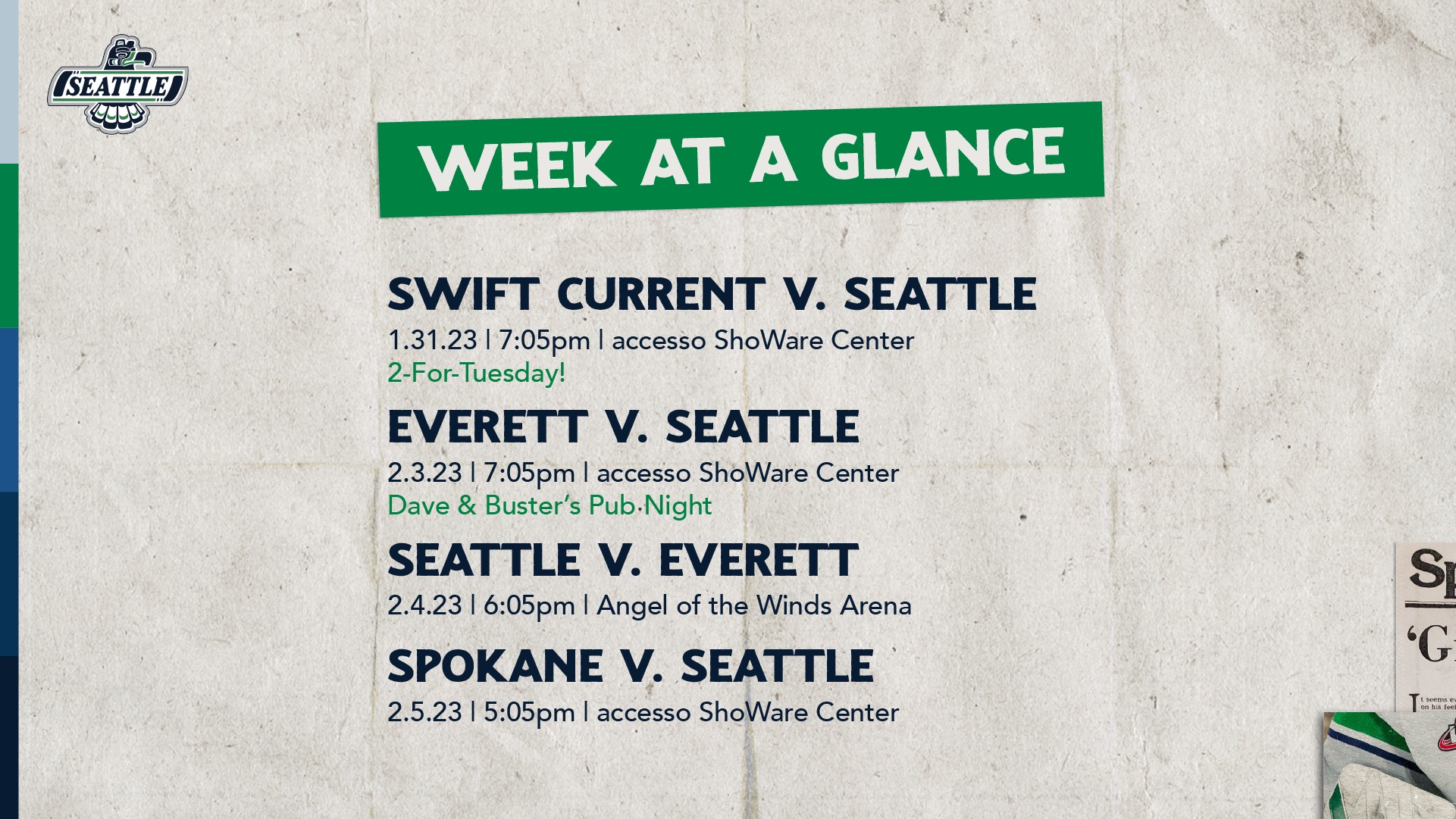
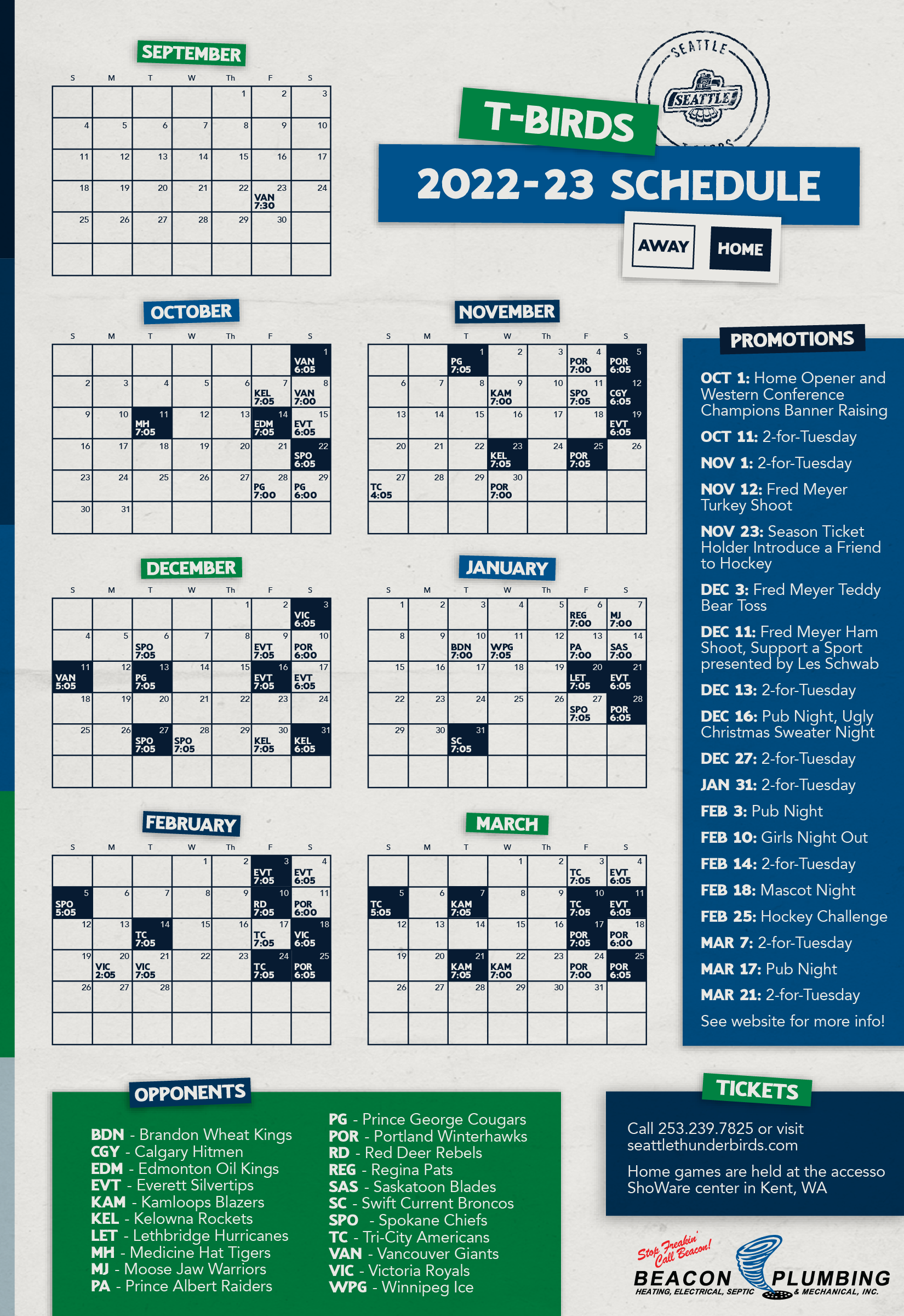
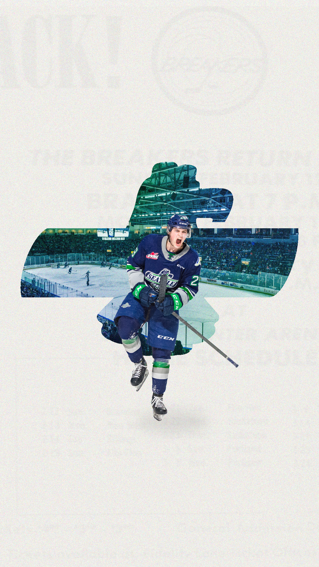
The Seattle Thunderbirds change their look and feel at the beginning of every new season. The team videographer and I are responsible for brainstorming and developing these new themes. We wanted to do something drastically different than the past couple years while also tying in our organizations rich history. Our inspiration for this year's started with retro trading cards.
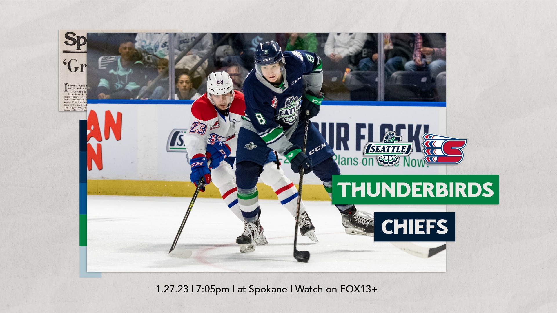
After much ideation, we ended up going 'newspaper retro.' Our final look incorporates a lighter color palette, paper textures, scanned clippings of newspapers, "vintage" photos, color bars, and a mail-style T-Birds stamp.
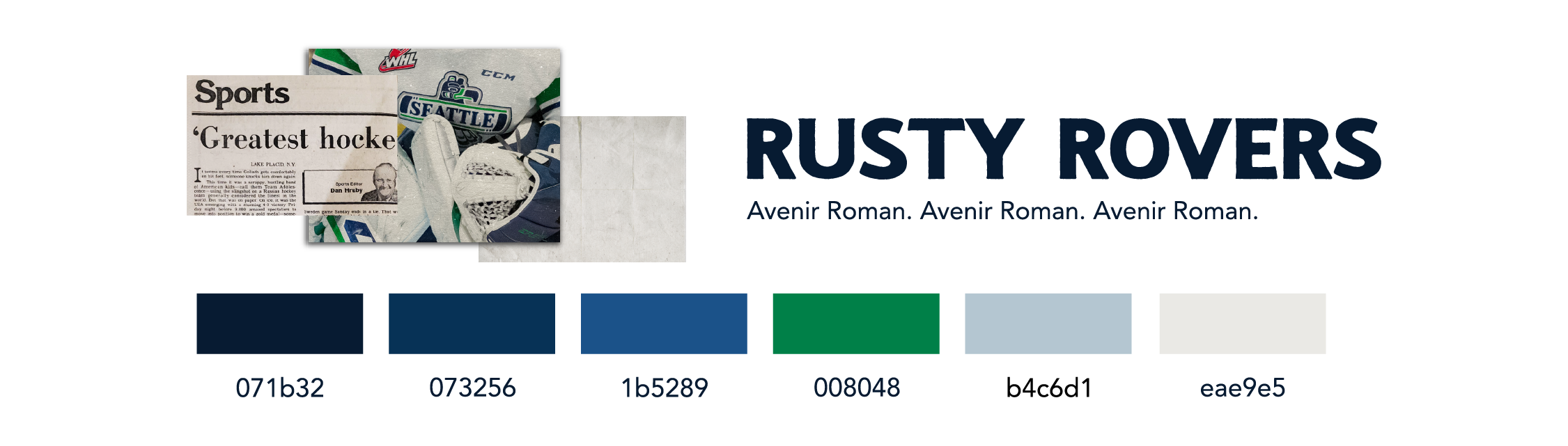
We chose Rusty Rovers for the type because of its funky but modern feel and Avenir Roman as its body copy pair as the angles of the legs and the widths of the typefaces compliment each other well.
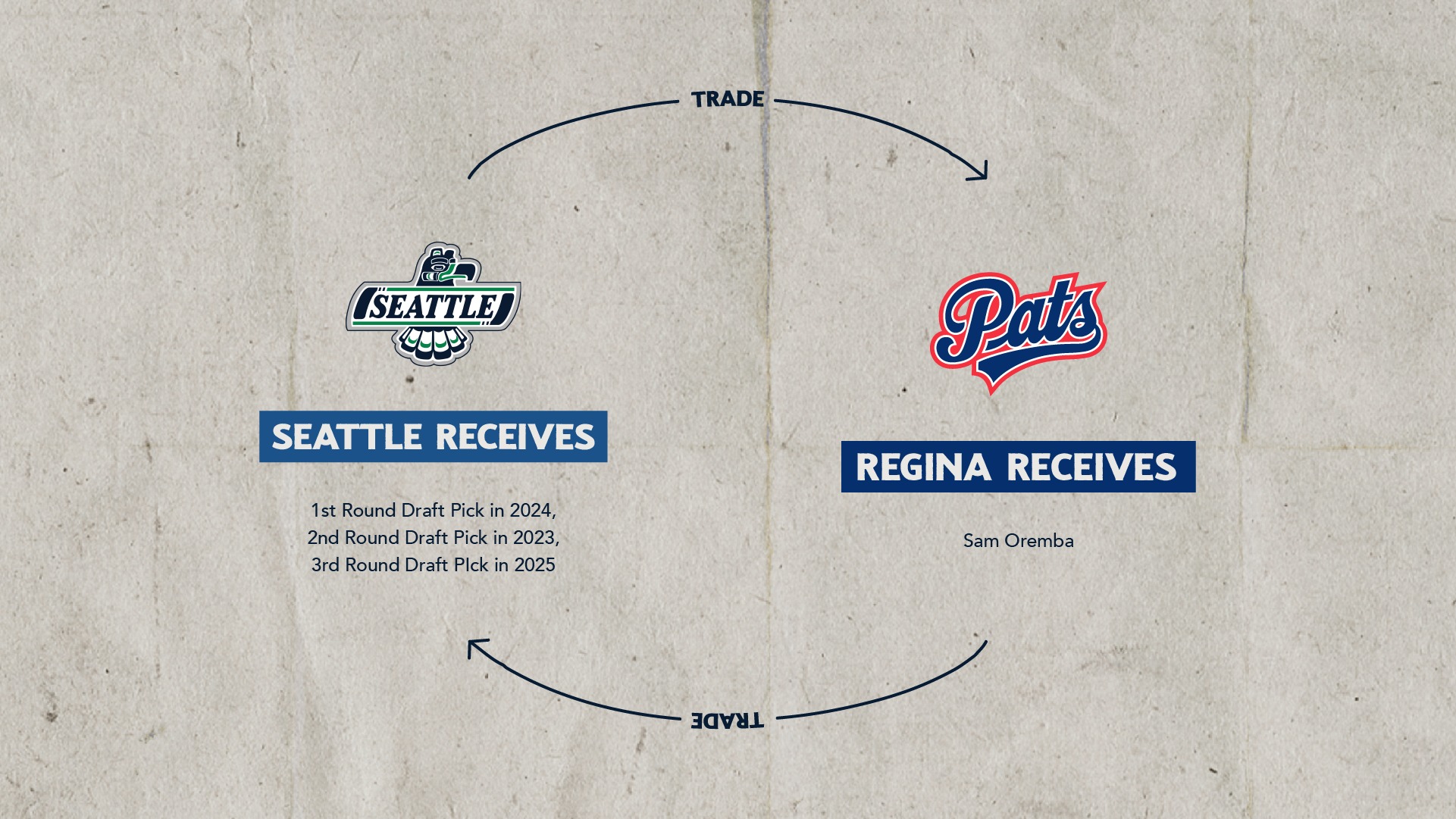
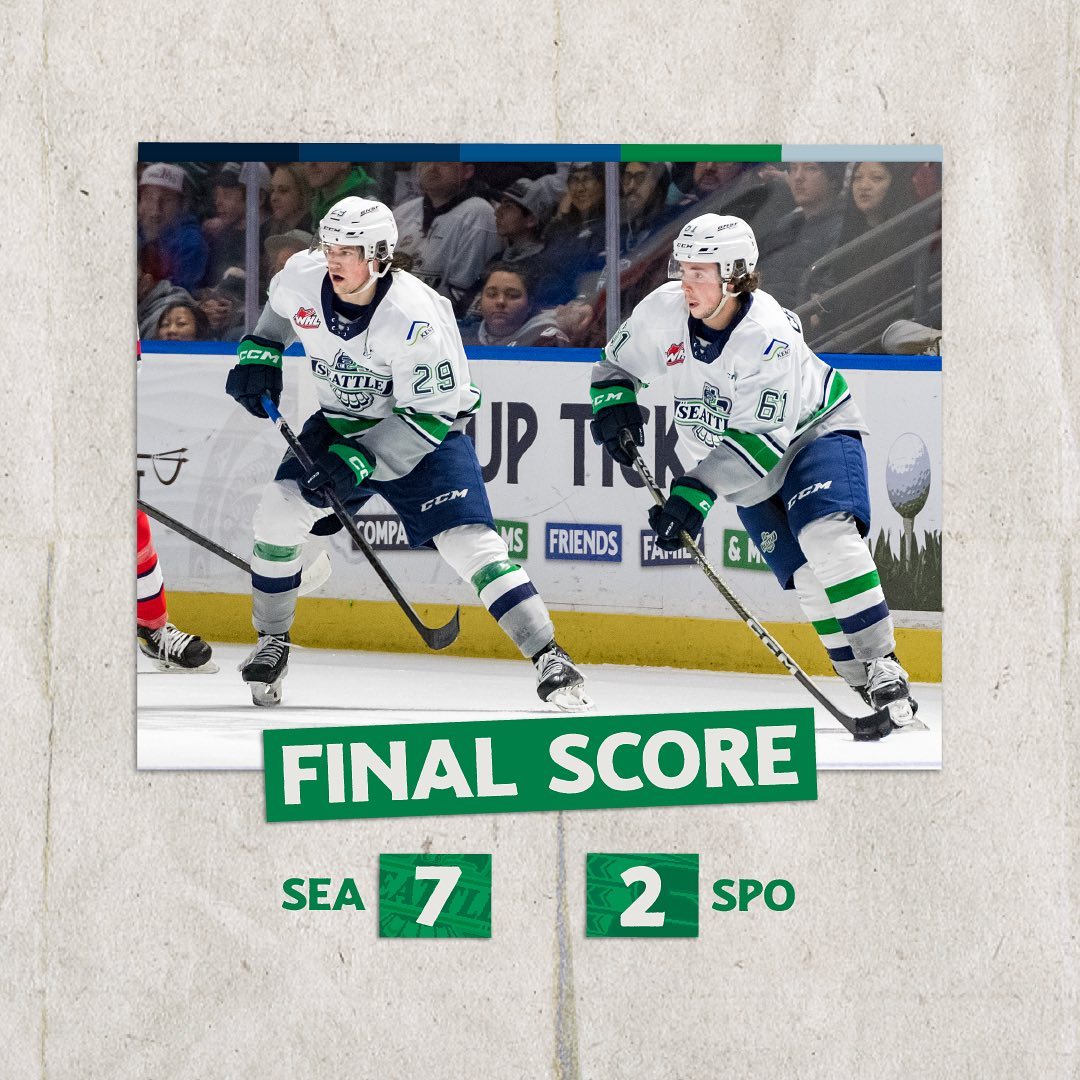
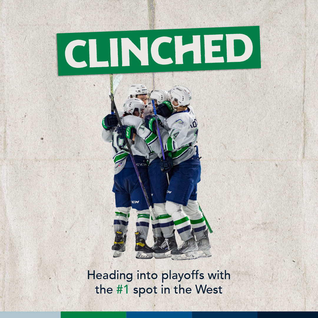
I've included a couple of examples of content I've created in this style below.
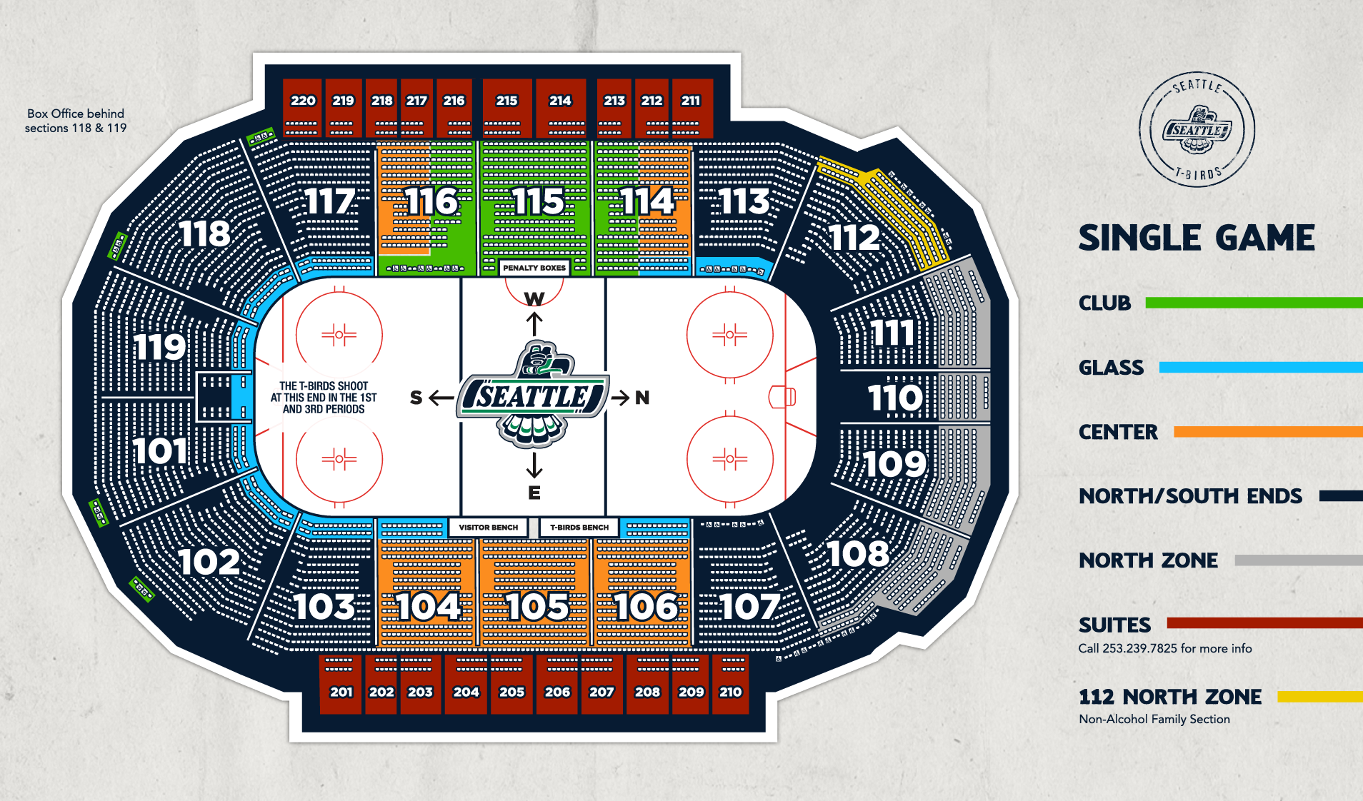
The accesso ShoWare Center installed a new videoboard at the start of the 2022-2023 season. I had the opportunity earlier in the season to design the lower ring scoreboard and upper ring sponsor loops, as well as I have the continuing opportunity to create main board content for every game!
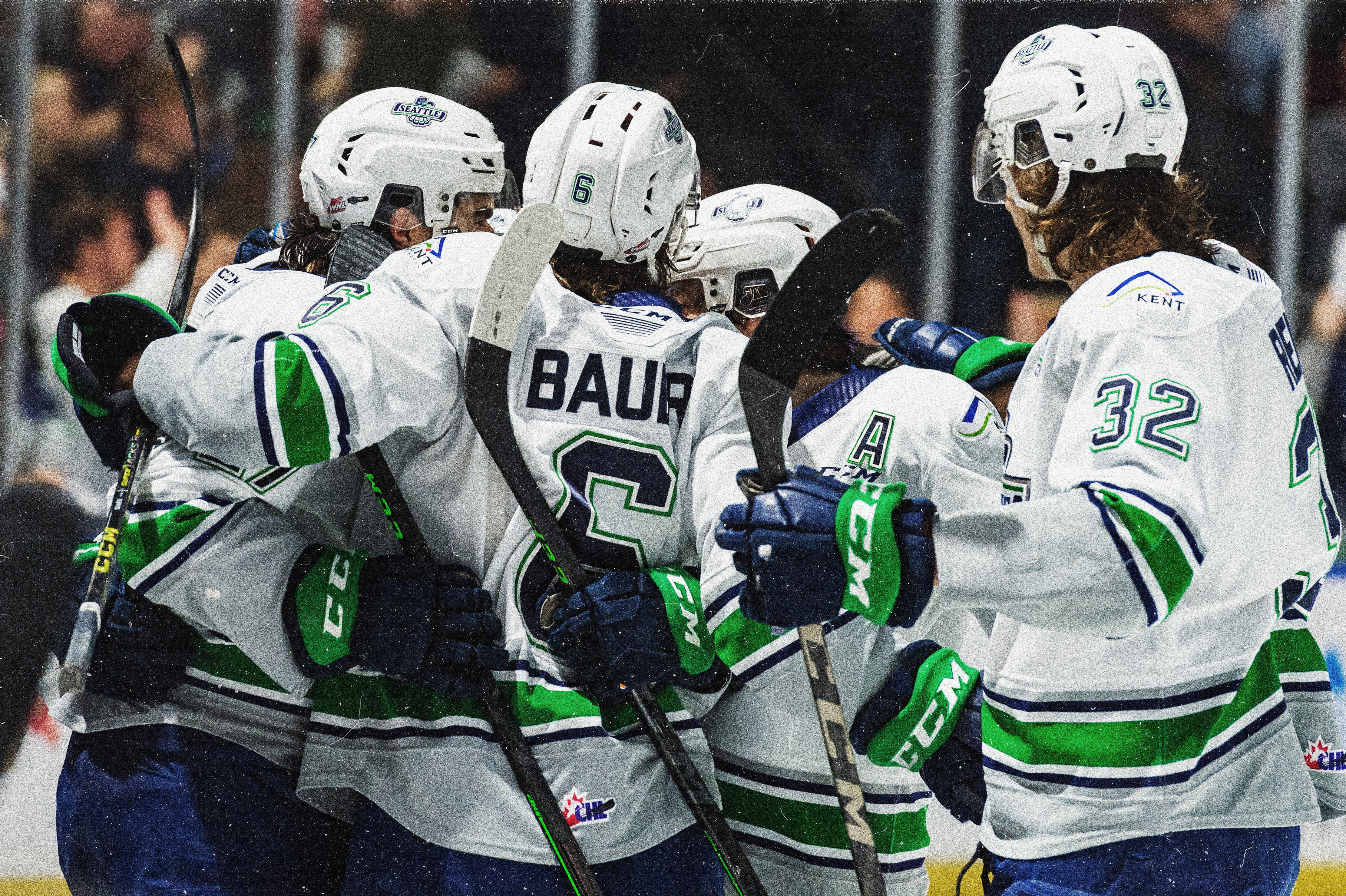
Photo taken by ©BLiessePhoto